All work

Case study · Product Design · Mobile Web App · Social Platform

Sqabl - Turning online arguments into structured, two-sided debates

Industry
Social · Community
My Role
Product Designer
Platform
Mobile web app
Scope
UI design · Design system · Interactive prototype
Open interactive prototype
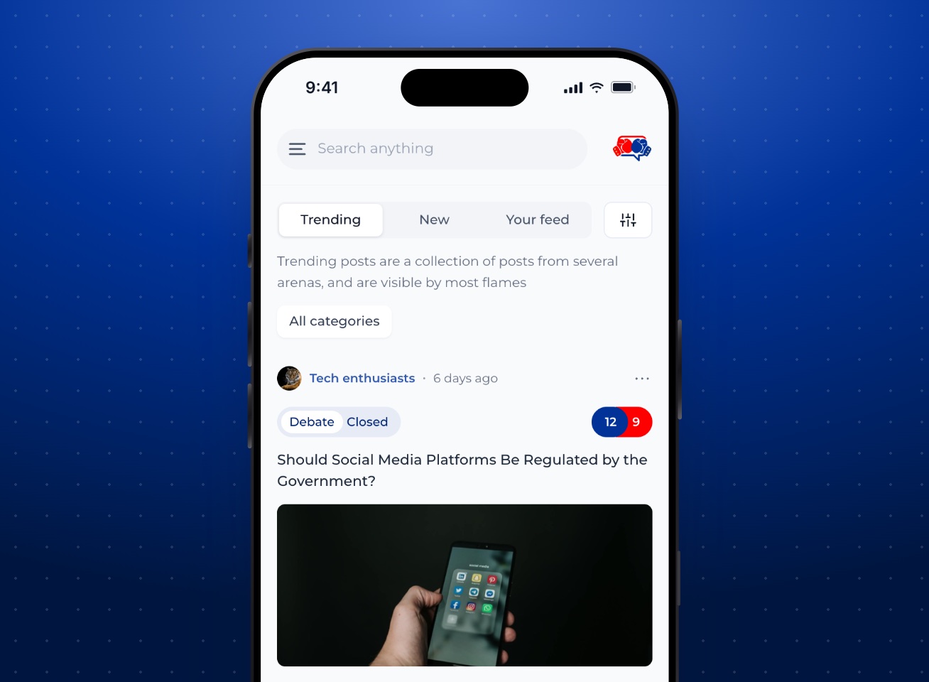
Sqabl home feed in an iPhone 16 Pro: trending debates with red and blue vote counts

01

Overview

Sqabl is a mobile web app for structured discussion. People join arenas (topic communities), then take part in three kinds of posts: debates with a supporting and an opposing side, polls, and open questions.

I designed the mobile app in Figma (sign-up, the feed, posting, debates, arenas, profiles and notifications, in light and dark mode), then built every journey into a working prototype so people can use the flows instead of just reading about them.

02

The Problem

Comment threads are a poor shape for disagreement.

In a long comment thread, the actual disagreement gets buried. Replies pile up, it’s hard to tell who is on which side, and nobody can see where the argument stands overall. I wanted a format where every argument belongs to a side and the split is visible at a glance.

The decisions I built the product around:

  • Every debate is two-sided: it shows a supporting and an opposing count, a percentage split, and arguments filed under a side.
  • Everything lives in arenas. You choose an arena when you post, and you accept its guidelines when you join.
  • Three post types (debate, poll, question) share one feed, ordered as Trending (most flames), New, or Your feed.
  • Moderation is built in: you can flag posts and people against a set of policy categories, block users, and, as an arena owner, appoint moderators.

I didn’t run user research for this project, so these rest on assumptions I still need to test: that people engage more thoughtfully when they pick a side first, that topic arenas cut down off-topic noise, and that visible guidelines plus flagging keep debates civil.

03

Goals

  1. [01]

    Make sides visible

    Anyone should see, at a glance, where a debate stands and which side an argument belongs to.

  2. [02]

    Lower the cost of taking part

    Voting, picking a side or answering should take one or two taps; writing should never be the only way in.

  3. [03]

    Keep topics in their place

    Arenas give every post a context and a set of rules, and give their owners tools to run them.

  4. [04]

    Safety without friction

    Flagging, blocking and guidelines are always reachable but never in the way.

04

User Journey

I mapped the product into four journeys, and each one works end to end in the prototype.

Get started

  1. Sign up with email
  2. Username, password, country
  3. Name
  4. Confirm 4-digit code
  5. Pick interests
  6. Join arenas
  7. Agree to terms
  8. Feed

Take part

  1. Feed
  2. Open a debate
  3. Pick a side
  4. Add an argument
  5. See the split update

Polls reveal results after voting; questions open an answer composer.

Post

  1. +
  2. Question, poll or debate
  3. Choose an arena
  4. Write and validate
  5. Post sent
  6. View in arena

Run an arena

  1. Create arena
  2. Invite fans
  3. Arena created
  4. Manage: moderators, guidelines
  5. Deactivate (confirmed)

05

Design Approach

  1. Colour carries meaning

    Sqabl blue (#003298), the colour of the wordmark, drives actions and navigation and doubles as the supporting side; red marks the opposing side. Everything else stays neutral, so the two sides are the only strong colours on screen.

  2. One card, three post types

    Debates, polls and questions share a card: arena and time, a type badge, the content, then the same action row (flame, replies, share, save) and one primary call to action.

  3. Choices in bottom sheets

    Arena picker, poll length, country, filters, guidelines and participant lists open as sheets over the current screen, so people never lose their place.

  4. Progressive onboarding

    Sign-up asks for one kind of information per step, with a progress bar, and ends by joining arenas so the first feed isn’t empty.

  5. Arenas as context

    Every post links to its arena; every arena shows its owner, members and guidelines before you join.

Key Screens

01 · Feed and debates

Read the room, then pick a side

  1. 01The red and blue pill on every debate card shows the current split before you open it.
  2. 02Debate details pair the percentages with a donut and two columns, one per side, each with its own Add argument.
  3. 03Arguments filter by side and sort by recency or flames.

02 · Polls and questions

Two lighter ways to take part

  1. 01Poll results stay hidden until you vote, so the current leader doesn’t sway the vote.
  2. 02Questions put “Answer question” in the header and list answers under the post.

03 · Arenas

Communities with rules

  1. 01Joining always goes through the arena’s guidelines and an explicit agreement.
  2. 02Non-members can read an arena but see a note that joining unlocks voting and posting.

04 · People

Profile, followers and notifications

  1. 01Followers and following open as a searchable sheet over the profile, with Follow and Unfollow inline.
  2. 02Unread notifications get a tint and a dot; each one opens the post, arena or person it’s about.

06

Dark Mode

The same product at night, without losing the two sides.

I designed dark versions of the mobile screens on near-black grounds (#0D0D0D and #171717). In the prototype you switch to dark mode from the side menu, and every component uses the same colour tokens as light mode, with a dark value for each.

Copying light-mode colours onto black doesn’t work, so I rebalanced them for contrast. Sqabl blue (#003298) almost disappears on black, so buttons and the supporting side use a brighter blue (#3768F0) that keeps white labels at 4.8:1. Text on tinted badges switches to light tints of the same hue (#A9BFFF for blue, #FF8A8A for red), so “Supporting” and “Opposing” stay readable. Surfaces step up in lightness, from ground to card to control to line, instead of relying on borders, and the selected tab sits on a raised grey. Initial avatars and the empty-state illustration have their own dark versions, so nothing glares.

Dark mode across the core journeys

  1. 01Red and blue still carry the two sides; everything else stays neutral.
  2. 02Badges, links and selected states use lighter tints of the brand blue, which meet 4.5:1 on dark surfaces.

Complete Flow

Onboarding

From email to the first feed

  1. 01A six-part progress bar runs across account, name, code, interests, arenas and terms.
  2. 02Errors appear under the field they belong to, and what you typed stays in place.

Posting

From “+” to the arena

  1. 01All three composers share one layout: arena first, content, options, then an optional image.
  2. 02The post button stays visible; tapping it with missing fields highlights exactly what’s needed.

07

Interactive Prototype

I built every screen above into the prototype, in a phone frame with a guided tour of each journey. Try signing up (the code is 4720), joining an arena, picking a side, posting a poll, or creating and deactivating your own arena. There’s no backend: it runs in your browser with sample data, keeps your changes on your device, and you can restart it at any time.

View prototype

08

Design System

The core tokens from my Figma file. Sqabl blue drives actions and stands for the supporting side, red stands for the opposing side, and a 10-step grey scale handles text and surfaces. Every token has a dark-mode value.

  • Sqabl blue · Supporting#003298
  • Blue tint#E6EBF5
  • Link#335BAD
  • Opposing#FE0000
  • Ink#101828
  • Surface#F9FAFB
Montserrat
Interface type · Regular, Medium and SemiBold, 12–20px
Components
Pill buttons (32px radius), 24px-radius inputs, bottom sheets, segmented tabs, badge groups, vote pill

09

Outcome & Reflection

I ended up with a complete mobile design and a prototype where every journey can be finished: no dead buttons, real validation, and consistent feedback for every action.

Building the prototype taught me the most. My static frames covered the happy path, but the prototype forced me to decide what happens with a duplicate poll option, a closed debate, a blocked user’s posts, or an arena with no posts yet. Those answers are now part of the design.

I haven’t measured outcomes, and no testing has been done yet. Next, I would test the core assumption (that picking a side first leads to better discussion) with a small group, check whether people understand flames without explanation, and look at how arena owners moderate in practice.

Open interactive prototype

Try Sqabl yourself

Every journey in this case study works in the interactive prototype.

Open interactive prototype