All work

Case study · Product Design · Web Application · Admin Dashboard

Wellness - Bringing hospital operations into one calm, connected dashboard

Industry
Healthcare
My Role
Product Designer
Platform
Web Application
Scope
UI design · Design system · Interactive prototype
Open live prototype
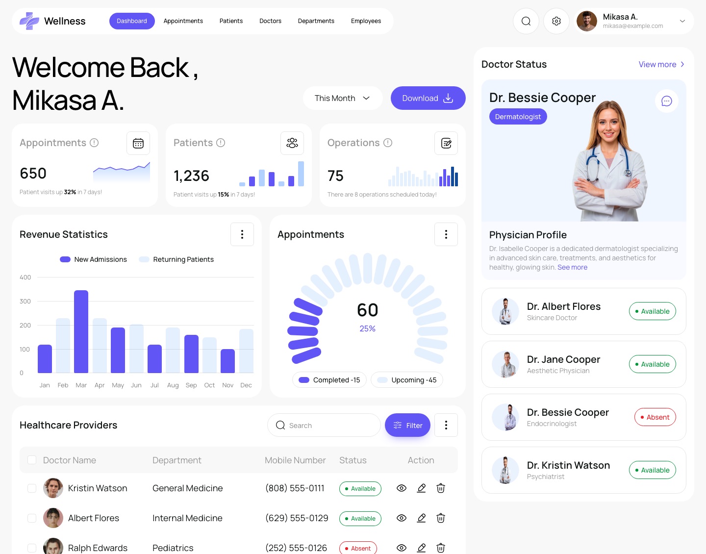
Wellness dashboard with appointment, patient and operation stats, revenue chart and doctor status

01

Project Overview

Wellness is an admin dashboard for hospital and clinic administrators. It brings the day-to-day records of a healthcare facility (appointments, patients, doctors, departments and employees) into one workspace, with a dashboard that summarises what needs attention today.

I designed the product end to end in Figma: information architecture, every screen and state, and a small design system. The design was then rebuilt as a working prototype you can use: search, filter, sort, add, edit and delete records, change settings and walk through sign-in, all running in the browser with sample data.

02

The Challenge

Lots of records, many roles, and very little time to look for things.

Hospital administration is made of many small, repeated tasks across several record types. The design challenge was less about any single screen and more about making a large surface feel predictable.

Design challenges the product had to solve:

  • Five record types (appointments, patients, doctors, departments, employees) that each need listing, searching, adding and editing, without five different ways of doing it.
  • A first screen that answers “what is happening today?” at a glance, instead of a wall of numbers.
  • Status that has to read instantly: confirmed, pending, discharged, active, absent.
  • Destructive actions (deleting a patient record, logging out) that need to be deliberate but not slow.
  • Account, billing and notification settings that grow over time and still need to stay findable.

03

Goals

  1. [01]

    One pattern, everywhere

    Every records page shares the same toolbar, table, filter, form and confirmation pattern, so learning one page means knowing them all.

  2. [02]

    Overview first

    The dashboard leads with today’s numbers, trends and who is available, then hands off to detail pages.

  3. [03]

    Status you can scan

    A small, consistent colour language for status, used the same way in tables, cards and badges.

  4. [04]

    Safe by default

    Every delete asks for confirmation and names exactly what will be removed.

04

Who It’s For

Hospital administrators
Keep an eye on appointments, admissions and operations, and download reports for the period they care about.
Front desk and scheduling staff
Find a patient or appointment quickly, add a new booking and update its status.
Department and HR leads
See who is in each department, who is available today, and keep doctor and employee records current.

05

Information Architecture

Dashboard
Stats (appointments, patients, operations), revenue statistics, appointment breakdown, doctor status and healthcare providers.
Records
Appointments, Patients, Doctors and Employees: one list, filter, add/edit and delete pattern applied to each.
Departments
Department stats and cards showing members and assigned staff, with a view-all list.
Settings
General, Plan & Pricing, My Account, Payment & Billing, Tax & Duties, Link Account, Time & Language, Password and Notifications.
Access
Login (with error state), Register, OTP verification, Forgot password and Create new password.

Key Design Solutions

A dashboard that answers “what’s happening today?”

  1. 01Three headline stats with a small trend chart each, so the number and its direction read together.
  2. 02Revenue statistics compare new admissions with returning patients month by month; the appointments ring splits completed, upcoming and pending.
  3. 03Doctor Status keeps a featured profile and today’s availability on the right, always one glance away.

One records pattern for every list

  1. 01The same toolbar on every records page: title, Add New, Filter.
  2. 02Avatars and names lead each row; status sits in a tinted badge near the actions.
  3. 03Rows-per-page, record count and pagination share one footer line.

Adding and removing records

  1. 01Forms open over the list with a breadcrumb, so you never lose your place.
  2. 02Delete always names the record: “Do you want to permanently delete …?”

Departments and staff

Settings that scale

  1. 01A fixed left menu and one Save Changes action for all nine sections.
  2. 02Each section pairs a short explanation on the left with its fields on the right.

06

Onboarding Experience

Creating a welcoming first experience.

The onboarding experience is designed to help people get started with confidence, understand the platform, and complete the steps they need to reach their workspace.

Wellness is a tool for hospital staff, so onboarding is about access rather than personal setup: creating an account, confirming it, signing in, and getting back in when a password is forgotten. Every access screen shares one split layout, with the form on the left and a panel on the right that explains what the product is for.

07

The Onboarding Journey

Three short paths, depending on who is arriving. All of them end in the dashboard.

New user

  1. Create Account
  2. OTP Verification
  3. Dashboard

Returning user

  1. Log In
  2. Dashboard

A wrong email address keeps the user on Log In with an inline error.

Account recovery

  1. Log In
  2. Forgot Password
  3. Create New Password
  4. Log In
  5. Dashboard

01 · New user

Create an account

  1. 01Only three fields (full name, email address and password), so signing up takes seconds.
  2. 02The password field has a show / hide toggle to avoid typing mistakes.
  3. 03“Already have account? Log In” sits right under the button for people who land on the wrong screen.

02 · New user

Verify the email address

  1. 01The screen repeats the email address the code was sent to, so users know where to look.
  2. 02Five separate boxes show progress digit by digit, and the active box is highlighted.
  3. 03A visible countdown (“Resend code in 00:37”) explains when a new code can be requested.

03 · Returning user

Sign in

  1. 01“Welcome Back” and a short line of copy make it clear this is the returning-user path.
  2. 02“Keep me login” and “Forgot Password?” sit on one line between the fields and the button.
  3. 03New users can switch to Register from the bottom of the form.

04 · Returning user

Recover from mistakes

  1. 01The error appears under the field it belongs to, not in a banner, and the field border turns red.
  2. 02The entered email stays in place, so fixing it is a small edit instead of starting again.

05 · Account recovery

Reset a forgotten password

  1. 01Forgot Password asks for one thing only, the email address, and says what will happen next.
  2. 02“Try another method” gives a way forward to people who no longer have access to that email.
  3. 03Create New Password asks for the password twice and reminds users it must differ from the previous one.

08

Onboarding Decisions

  1. Account creation

    A short form and a clear heading (“Create Account / Enter your details to sign up”) introduce the product without asking for more than it needs.

  2. Sign in and recovery

    Sign-in, “Keep me login” and “Forgot Password?” live on one screen, and recovery takes two steps before returning to Log In.

  3. Collecting information

    Each screen asks for one kind of information: identity on Register, a code on verification, an email on recovery.

  4. Personalisation

    As an admin tool, Wellness has no preference or goal screens in the design; personal details are managed later in Settings › My Account.

  5. Progression and navigation

    Every screen has one primary button and a text link to the other path (Register ↔ Log In), so users always know the next step.

09

Interaction & Workflow

The prototype works end to end, so the flows can be tried rather than imagined. Changes are saved in the browser and can be reset from the profile menu.

  1. Find

    Global search from the header jumps to the matching record; each table also has its own search, filters and sortable columns.

  2. Add

    Add New opens a validated form; required fields and phone and age formats are checked before saving, and a toast confirms the result.

  3. Review

    View opens a record’s details with quick status changes; Edit reopens the same form, filled in.

  4. Clean up

    Select rows for bulk delete; every delete goes through a named confirmation.

  5. Report

    The dashboard date range updates the stats, and Download exports a CSV report.

10

Design System

A small, quiet system: a soft grey canvas (#F8F8F8), white cards with generous radius, an indigo primary for actions, a blue used only as light tints for charts and toggles, and status colours used only for status.

  • Primary#6155F5
  • Blue (tints)#0068FF
  • Ink#0D1311
  • Success#009637
  • Warning#FF9100
  • Error#ED1C24
Manrope
Interface type · Regular, Medium and SemiBold
Components
Pill buttons, 10px-radius inputs, 22–26px cards, status badges on a 10% tint of their colour

Responsive Design

The same dashboard at phone width

  1. 01On smaller screens the navigation moves into a drawer and the dashboard stacks into a single column.
  2. 02Wide tables scroll sideways inside their card; forms become bottom sheets on phones.

11

Outcome & Reflection

The result is a complete set of screens and a working prototype that behaves like the product: every button does something, and the main tasks can be completed from start to finish.

The biggest lesson was how much a shared pattern carries. Designing the records page once, carefully, and reusing it for appointments, patients, doctors and employees did more for consistency than any individual screen. Building the prototype also exposed states the static design glossed over (empty search results, bulk selection, validation messages), which are now part of the design.

Next, I would test the flows with front desk staff to check the wording of statuses and the order of table columns, and design role-based views so each team sees only what it needs.
Open live prototype

Have a product challenge worth solving?

Let’s create digital experiences that make complex things feel simple.

Let’s Work Together